Exposure Review A reflective look at your photographs.
Receive personalized feedback on your images from Alejandro Cerutti, Artistic Director of Exposure Photo Gallery.
This service is designed as a growth tool. Each review offers a technical and detailed analysis of each image, aimed at helping you identify strengths, areas for improvement, and compositional resources to enhance your photographic practice.
The suggestions follow a clear structure: first, possible improvements to consider at the moment of shooting; then, adjustments related to the richness of light and color contained in the RAW files; and finally, if necessary, digital editing recommendations.
The report is delivered in writing within a maximum of 7 business days from the reception of the images and will include a visual example to accompany the theoretical observations, making it easier to understand and apply the suggestions.
An external perspective can make a difference. Let your work evolve with expert guidance.
How it works:
1. Upload as many photos as you want. You can send a single image or several, depending on what you want to review.
2. Fill out a short form with questions about your work. This will help us better understand your intention and ensure that the feedback addresses your own learning needs.
3. Follow the online payment link to confirm your request. Once the process is completed, we will begin working on your photo review.
Personalized analysis by Alejandro Cerutti
Alejandro Cerutti is a photographer. His works have been exhibited in galleries in New York and Los Angeles and are part of private collections in various countries.
He trained in New York with masters such as Bryan F. Peterson and Jay Maisel, whose teachings deeply shaped his way of observing, teaching, and guiding photographic processes. His review approach reflects these experiences: deep attention, honest insight, and commitment to each photographer's growth.
He also finds inspiration in figures such as Robert Doisneau, Steve McCurry, Ernst Haas, Saul Leiter, and Vivian Maier, among others.


What is an Exposure Review like?
Below we share a real example of a review, based on five photos submitted to the contest The Silent Beauty by photographer S.M.
This example shows how the written review is structured: an individual comment for each image submitted, with precise observations focused on visible technical decisions made during shooting.
It reflects the style, depth, and approach you will receive if you request your Exposure Review.
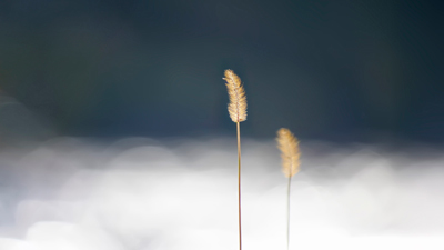
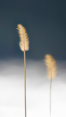
Photo 1
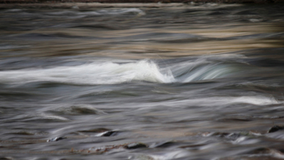
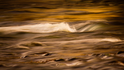
Your photograph offers a very soft look at moving water, creating an image that, beyond being documentary, approaches the pictorial. The use of a slow shutter speed to capture the movement invites contemplation. The white crest in the center of the image works as a visual anchor, standing out against the web of lines drawn by the currents.
In the edited version, I mainly worked on two aspects: framing and color.
On one hand, I suggested a slight reframe downward (achievable by lowering the camera at the moment of capture), removing a thin strip at the top that revealed what seemed to be the opposite shore. This change preserves the abstract character of the image, avoiding any literal or spatial reference that might interrupt the more sensorial visual experience. Based on the idea that “what doesn’t add, subtracts.”
As for color, I moved toward warm tones, reinforcing the golden hues already present in the original file. This can be done by adjusting the color balance in-camera at the moment of shooting or later from the RAW file with software such as Adobe Camera Raw. This change responds to an expressive decision, inspired by Jay Maisel’s concepts of “light, color, and the visual gesture.” By intensifying the warmth, the image acquires a more evocative character, as if the water were imbued with twilight light.
One point I suggest considering for this type of shot is using a tripod. Stabilizing the camera will allow elements other than the water (such as the rocks) to remain well-defined, providing points of sharpness where the eye can rest, contrasting with the overall fluidity.
Photo 2
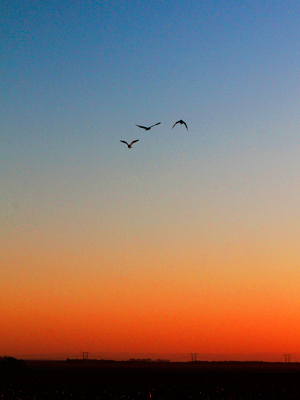
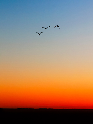
This image has an immediate power: three birds in flight, perfectly arranged in the sky, silhouetted against a gradient of beautiful sunset colors shifting from light blue to deep orange. The composition is clean, with a clear and direct reading. There is something very serene in the scene, and it is felt instantly.
In the editing, I worked on some details that help reinforce that atmosphere:
First, I reduced the digital noise of the shot (that “color palette” visible in the sky, which appears for example when shooting with high ISO) using Imagenomic’s Noiseware software. It’s a small technical adjustment, but it adds a lot when working with broad, smooth surfaces like the sky, making the image look cleaner.
Then, there was a decision regarding the power towers on the horizon. My opinion: I feel the photo relates more to natural elements, and that industrial trace takes me out of the mood. For me, if the focus is on nature, calm, and flight, the towers are distracting. Their removal can be done at the time of capture (by changing your position or framing) or later with Photoshop in postproduction.
As we've said, “what doesn't add, subtracts,” so I also removed some reflections at the bottom. I don’t know if it would have been possible to avoid them at capture while keeping that piece of ground visible (to avoid them, the visible portion of soil would need to be smaller); in this case, I eliminated them with Photoshop.
Once that was done, I felt the distance between the birds and the top edge was too large, so I slightly adjusted the framing with a crop to balance the proportions better; this could also be achieved in-camera with a longer zoom. I also increased saturation slightly with Photoshop's Vibrance tool, giving more presence to the sunset colors, which are also undeniable protagonists of this photo.
Photo 3

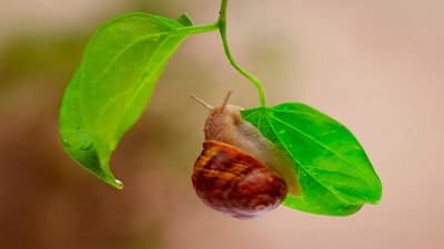
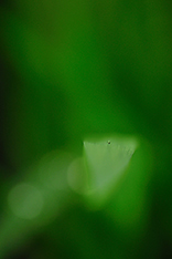
This scene conveys something tender and simple, yet at the same time a sensitivity attentive to detail. Finding a snail and capturing it hanging from a leaf requires pause, and that feeling comes through.
At the editing level, I worked on several adjustments meant to enhance what was already well captured in the original shot.
The first step was to remove two blocks of information that visually did not contribute: the lower part (which seems to be the edge of a pot) and a dark area in the background to the left. These elements distracted from the main subject. As Jay Maisel says: “the background is yours too,” and in this case, it's worth taking that control.
This can be resolved at the moment of capture by lowering the camera angle slightly and moving laterally to achieve a cleaner, more even background. Once that was solved, you could also move closer to the snail, eliminating distractions around it (I cropped digitally in Photoshop).
During the crop, the top still showed part of a third little leaf, which added more noise than visual interest, so I removed it. That could also be anticipated in-camera by adjusting the framing slightly to avoid anything “hanging” that doesn't contribute.
Another point to consider is the aperture: in this type of photo, it may be worth closing it down more (higher f-number) to achieve greater depth of field so the entire snail shell is sharp (here only one antenna is in focus).
Finally, I adjusted the color balance to add a bit of overall warmth to the scene. This change reinforces the image's friendly and approachable feel.
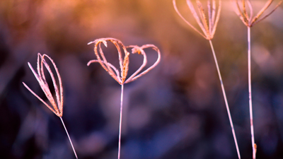
Photo 4
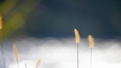
The photo starts from a very delicate scene, where the main elements are well seen and silhouetted against a soft, blurred background. The glow in the background adds a lot, and those small stems backlit have presence and beauty.
Where I intervened was in some things that didn't fully convince me.
First, showing the environment beyond the main elements isn't necessarily wrong. But in this specific case, I felt those details on the left were a bit distracting. That's why I decided to focus exclusively on the main stems and removed them digitally to show you what I mean; but this could be resolved at the moment of capture, which I recommend, if you can't make their presence contribute.
Of the two central plants, the one on the left was located right on the border between the light and dark background. That tension didn't work for me. What I did was “raise it” (digitally recreated for neatness) to show you how it would look positioned against the darker area. This could be easily resolved at capture: by lowering the camera angle slightly, you'd already have a better composition.
Once I had a cleaner version without distractions, I still felt something was off. So I tried a vertical crop. The same could be achieved in-camera with a longer lens or by moving closer.
Photo 5
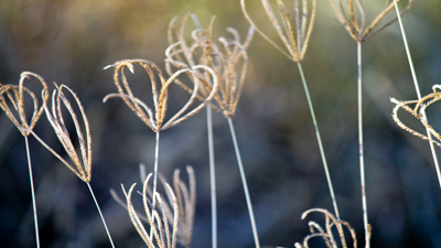
The original image has a very interesting starting point: delicate forms, simple lines, a soft background. But with so many of these structures close together, the clarity of the composition is somewhat lost—it ends up looking like a slightly visually cluttered block.
What I proposed was to isolate the small plants, giving them space and air. This could be resolved at the moment of capture by moving yourself to avoid too much overlap. In this version, the central structure becomes the protagonist, while the side ones accompany more softly, blurred, without stealing attention.
I also shifted the camera (digitally) to the left, so the two plants on the right are closer to the edge and those on the left have more air before the edge.
This is an example where I leaned toward simplification. Of course, one could also work toward “filling the scene” instead of emptying it. That’s worth experimenting with in-camera, choosing what appears fully, what partially, and the spaces in between. I’d recommend trying this with the camera on a tripod, which gives you the chance to study the composition more calmly.
Final Reflection
Throughout these five images we saw an honest, sensitive search, attentive to beauty. There is already a gaze considering Jay Maisel's “gesture”—“what happens.” In each image, there is an interpretation worth nurturing and refining.
From a curatorial perspective, the interventions aimed to organize what was already present. Sometimes it was removing distractions, other times changing the shooting angle or proposing a cleaner, more focused reading. There is no single formula, but there is an intention: for each image to say what it wants to say without interference.
Small color decisions were also suggested (to give color a more significant weight) or framing choices that could have been made in-camera. Nothing complicated—rather simple gestures that add up. Sometimes just taking one step, crouching slightly, or turning the camera makes a big difference. That level of awareness at the moment of shooting ultimately elevates a photo.
One aspect maintained with great consistency was the treatment of light. Across the five images there is clear attention when choosing to shoot: light with intention. That sensitivity is fundamental and is also what begins to give visual unity to a body of work.
The gaze you are building carries intention, intuition, and sensitivity. Keep trusting that, exploring, and enjoying the journey.
Recommended photographers to keep exploring and be inspired by:
Ernst Haas - Pioneer of color photography. His work with light, movement, and saturation remains a key reference.
https://ernst-haas.com/
Frans Lanting - His nature photography is a great example of how to capture the natural world with sensitivity, color, and clarity.
https://lanting.com/
Robert Mapplethorpe - Although best known for his portraits, his flower series is a perfect example of how to work with form, light, and color with almost sculptural precision.
https://www.mapplethorpe.org/
A quote for the journey
“You are responsible for every part of your image, even those you are not interested in.”
— Jay Maisel